Thank you for contacting Meydan Free Zone. We have successfully received your submission. Our team will review the details and get in touch with you shortly.
Oops! Something went wrong while submitting the form.
1. Introduction to Our Brand
Our Brand
Hello, we are happy that you are here. Our brand identity was created using a complex methodology that combines a unique value proposition and expert design thinking. It is the skin that holds our corporate body together.
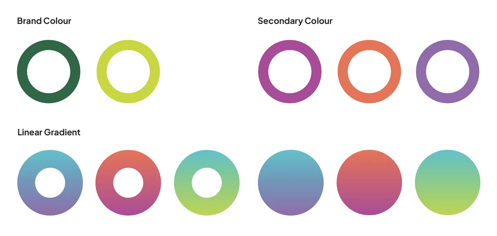
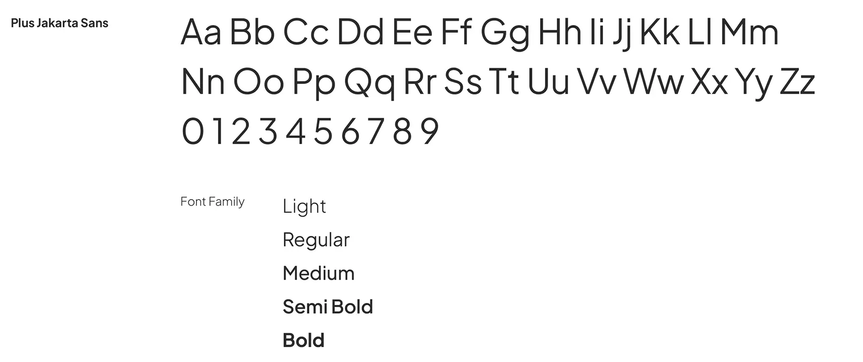
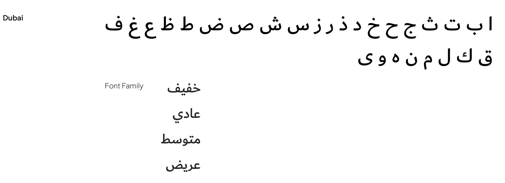
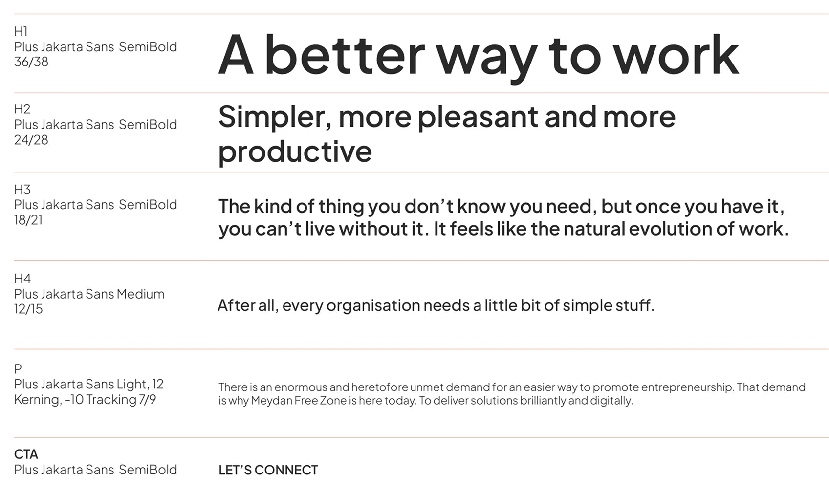
This document contains the rules for our visual communication system. Guidelines within this guide cover treatment of assets such as the company name, brand vision, mission, essence, logo, company colours, and typography. Please adhere to these guidelines to create a brand image and perception that are consistent no matter where they’re seen.
To be the world-class hub for entrepreneurship and innovation in the region.
Our Vision
To be the world-class hub for entrepreneurship and innovation in the region.
Our Mission
To make entrepreneurship accessible and inspire business growth.
To foster a vibrant and connected ecosystem for entrepreneurs and innovators to create, grow, and lead.
Brand Personality
We are passionate, down to earth and to the point. We like to keep things straightforward, making the complex clear and simple. While we act boldly and with confidence, we’re never boastful.
We like to challenge the status quo, not to be rule breakers but because we believe there’s always a better way to get things done.
We represent all things superlative, enabling those in the Meydan Free Zone world to also surpass their competition and attain superlative status.
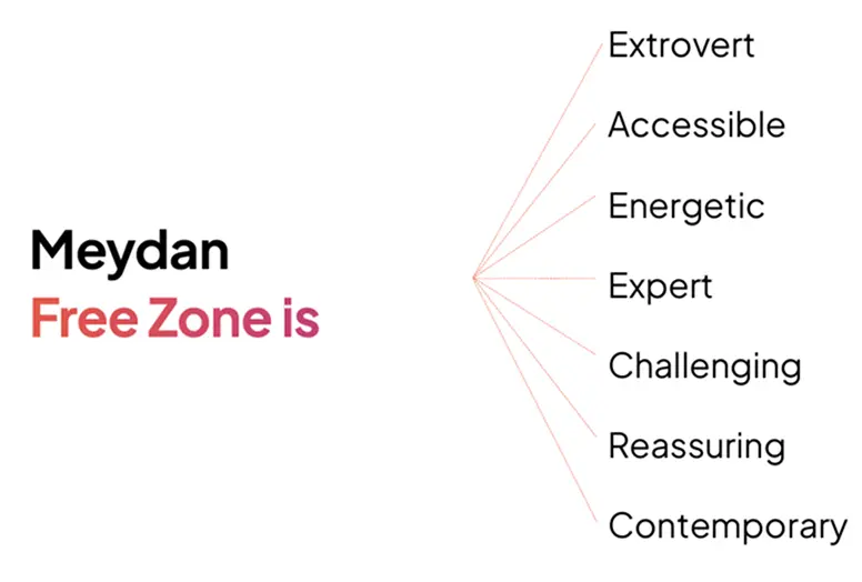
Brand Attributes
Our brand attributes are the standard means by which all of our subsequent branding work would be measured, so it is important to ensure that they truly represent the heart and soul of the company.
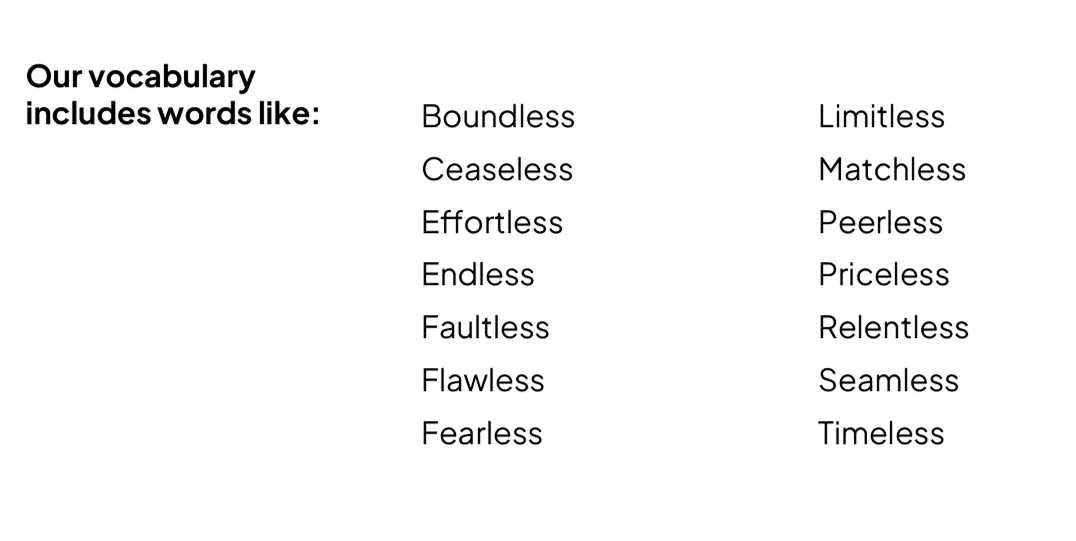
Our Vocabulary
This state of the superlative is conveyed through the usage of positive -less words, which should be integrated into our messaging to drive home the essence of our brand, and to resonate with our audience.
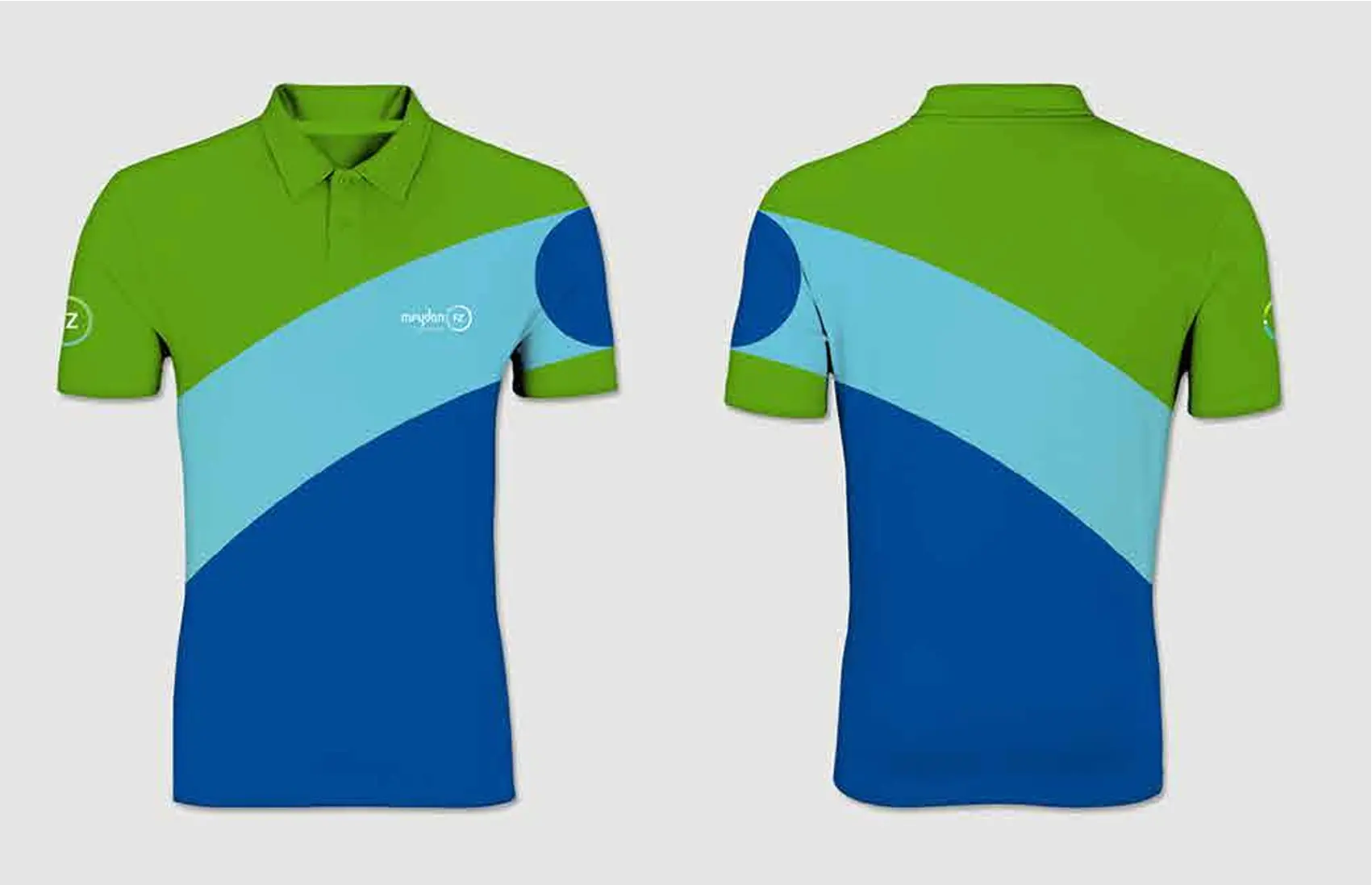
The Duality Design philosophy creates a connection between two elements. The Duality Design philosophy helps us see both sides of a story and creates compliments from contradictions.
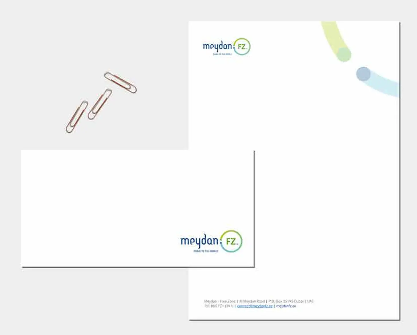
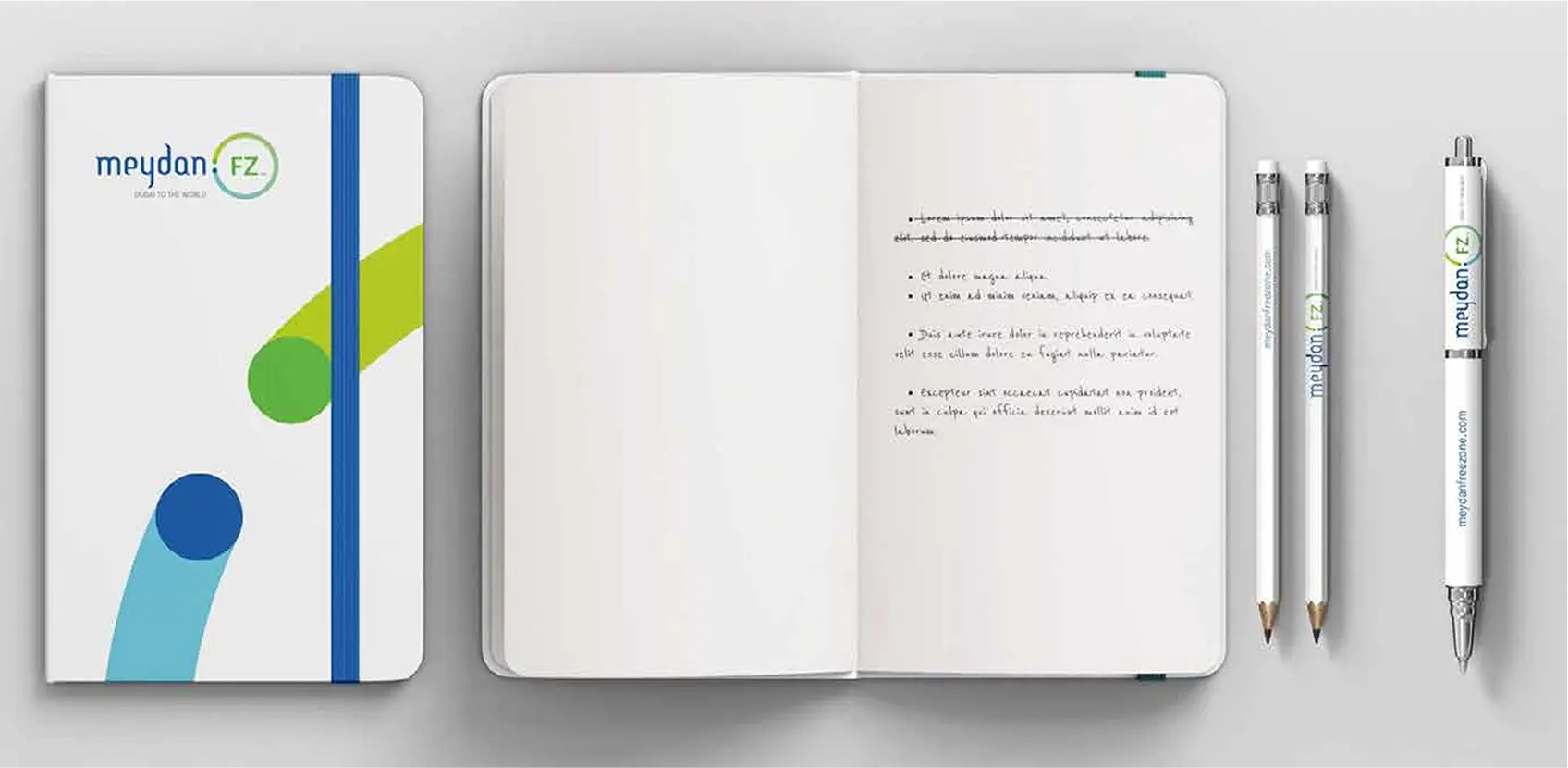
Logo Variations
Logo Usage on backgrounds
The full colour logo should be used only on a white or light coloured backgrounds, where the colours and shapes are visible and do not merge into the background.
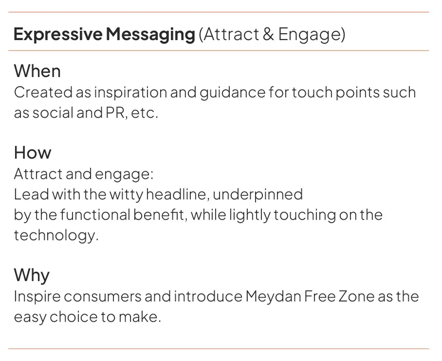
The Meydan Free Zone’s voice is evolving to unite our brand and meet our audience’s needs. We’re confidently turning down the volume of competing messages to elevate experience, removing obstacles in the way of people f inding exactly what they seek from us. By using both functional and expressive voices, we’ll create more space for brand relevance, connection and joy. We want to educate people without patronising or confusing them. We impart our expertise with clarity, empathy,and honesty.
We are in the business of opening doors for SMEs hence we can relate to our audience’s challenges and passions and must speak to them in a familiar, warm, and accessible way.
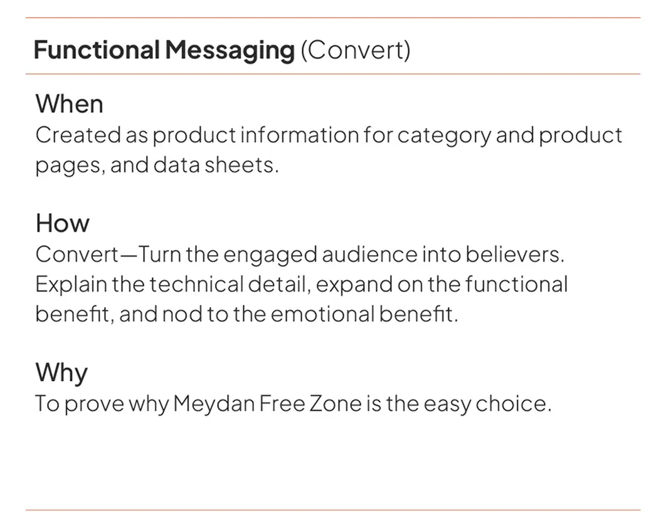
Functional
Functional means helpful—it organises things in a clear way and anticipates our customer’s needs, to have an easy, enjoyable experience online and at our offices. Used primarily for wayfinding and buying for our services, this copy is so seamlessly integrated that it calls attention to the product—not itself. Functional doesn’t mean sterile; it means clear.
Expressive
Expressive copy is where our brand personality unfurls with day-making thoughts. We use expressive moments on focal products to present a product truth in a fresh, relevant, interesting way. When we have the space, we tell a passionate entrepreneurial story. But even with just a few words, our copy can inspire—always taking into account where our audience is interacting with us—and making every word count.
Tone
Our tone is usually informal, but it’s always more important to be clear than entertaining. We use active voice and avoid passive voice. We must avoid slang and jargons. Write plain English and use classic Arabic. Our use of language should be positive rather negative.
Tonal Hooks
Straightforward
Do not bombard our consumers with technological speak, they just want to know if what they’re buying does what they need it to do. Straightforward language.
Easy
We make it as easy as possible for our audience to set up a company. Our digital innovations help our audience to make their decisions easy.
Reliable
Our audience need the reassurance that what they’re investing in is tried and tested, recommended by people whose opinion they trust.
Bright
Our audience gravitate towards brands that brighten up their day. We speak to them like an adult who enjoys that witty spark. We’re smart, and so are they – we know that they get it.
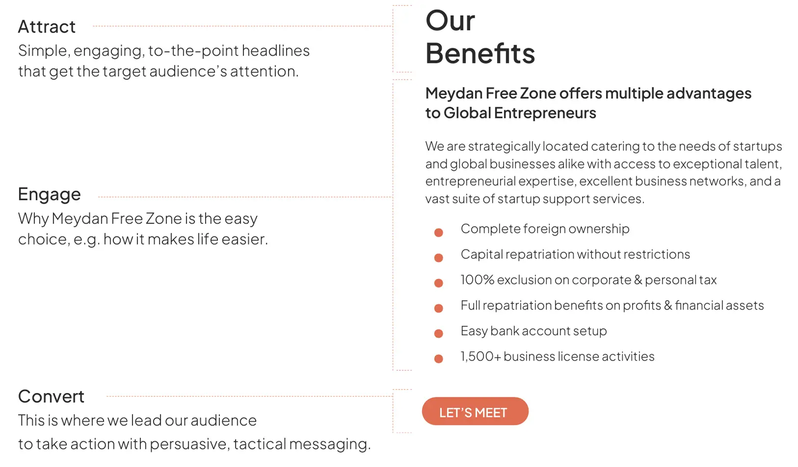
When to be functional. When to be expressive.
Tone of Voice in Action
Writing Style Guide
A style guide is a point of reference for grammar, punctuation and spelling. A set of standardised rules mean all communications for Meydan Free Zone, no matter who has written them, will always be consistent.
Headlines should be written in short, concise sentences – two or three words are expected. All copy is to be stylised in capital letters using our font family for print executions, and digital executions. Use full stops to punctuate, if necessary.
Copy including captions, credits, standfirsts, caveats and subheads should all be written in sentence case, using our font family. And should always be closed with a full stop.
All content and communications must adhere to British English spelling and grammar.
Writing goals
With every piece of content we publish, we aim to:
Empower
Help people understand what Meydan Free Zone is by using language that informs them and encourages them to that leap of faith called entrepreneurship.
Respect
Treat our users with the respect they deserve. We ought to put ourselves in their shoes. Be considerate and inclusive. We do not want to market at people; we want to communicate with them.
Guide
Think of yourself as a tour guide for our users. Whether you’re leading them through our website, emails, socials, communicate in a friendly and helpful way.
Speak truth
Understand Meydan Free Zone’s place in our audience’s lives. Avoid dramatic storytelling and grandiose claims. Focus on our real strengths.
Educate
We want to educate our users on what they need to know about our free zone and our products in a way that’s inspiring to them, not us. Give them the exact information they need, along with opportunities to learn more, all call-to-action must be clear and approachable. Remember that we are the experts of our products and services, and our users don’t have access to everything we know.
Writing Principles
In order to achieve those goals, we make sure our content is:
Clear
Understand the topic you’re writing about. Use simple words and sentences.
Useful
Before you start writing, ask yourself: What purpose does this serve? Who is going to read it? What do they need to know?
Friendly
Write like a human. Don’t be afraid to break a few rules if it makes your writing more relatable. All of our content, from splashy homepage copy to system alerts, should be warm and human.
Appropriate
Write in a way that suits the situation. Just like you do in face-to-face conversations, adapt your tone depending on who you’re writing to and what you’re writing about.
6. Imagery
Visual World
With every piece of content we publish, we aim to:
Authentic and Extraordinary
Passion, precision and perfection are integral to the visual aesthetic of our images. The style is minimalistic and clear-cut, with the situation in each image depicted in an authentic, assured manner with a focus on the essential. The images don’t look at all staged, and yet every single detail is meticulously composed.
The result is exclusive snapshots of authentic situations, perfectly pairing sophisticated lighting with a subtle colour mood. The vehicles look not like exhibition objects, but like part of a natural environment. This allows us to create high-quality, emotionally-charged images that move and fascinate the viewer, while also expressing our bold, sophisticated and optimistic attitude.
The images are powerful, and express understatement with a premium standard, and reflect at the same time a balance between perfection and authenticity.
Attitude
brave | curious | approachable | optimistic
The attitude of people used in our images is optimistic with a confident, nonchalant way about it - but in a likable and approachable way. We show people with charisma, who radiate determination and curiosity.
Freestyle Perspectives
unseen | courageous | surprising | detailed
Freestyle perspectives characterise our imagery with their emotional and diverse personality. These shots have charisma and tell a story in a fascinating, refreshing way. These shots surprise with their unseen perspectives and intriguing image cropping, and embody passion with their dynamics. They trigger emotions in the viewer, communicating closeness and warmth, and enabling our details or other design characteristics to be staged in an emotional way.
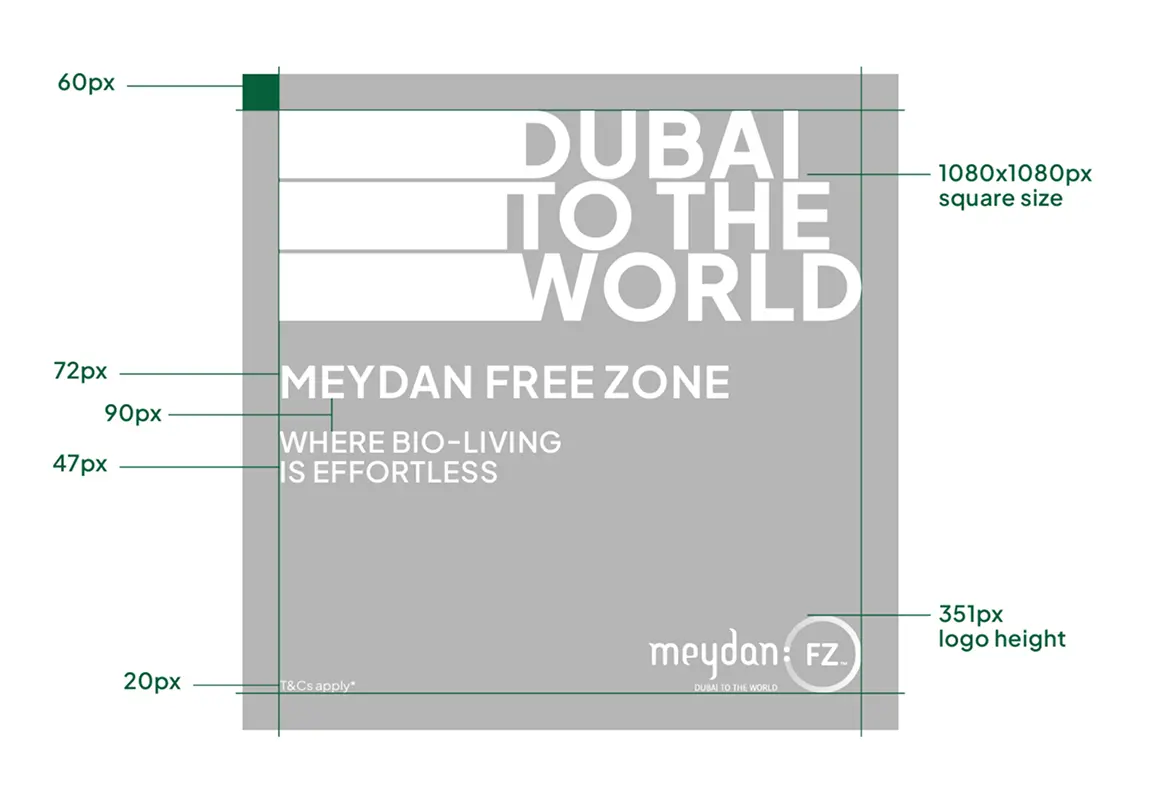
AD Templates
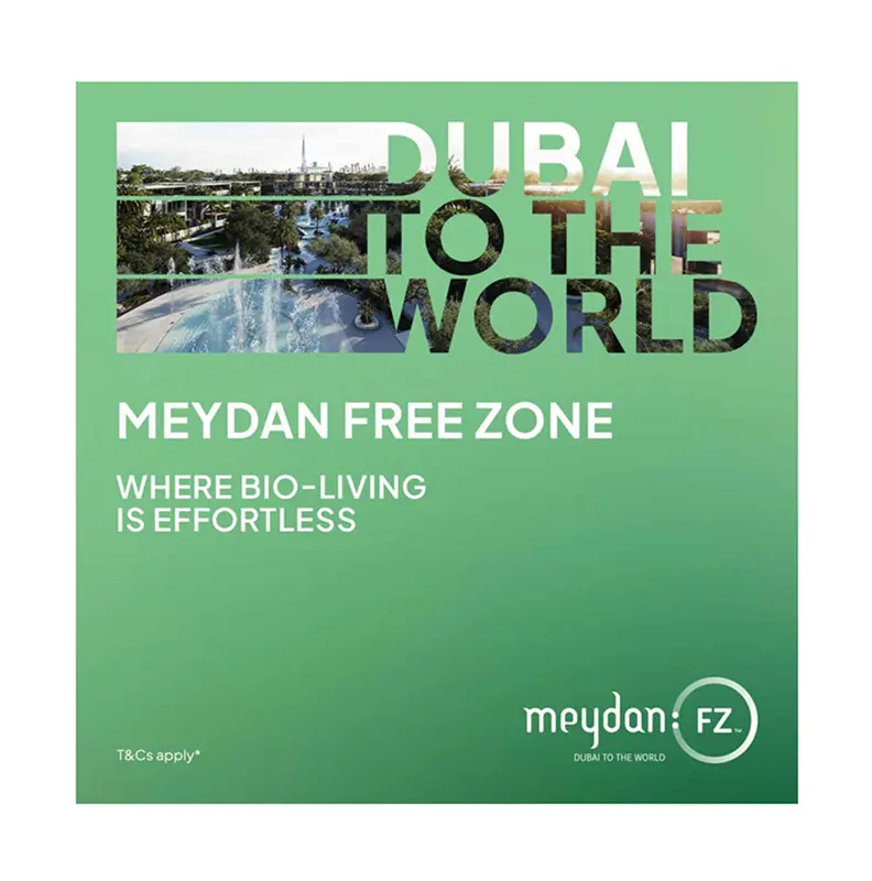
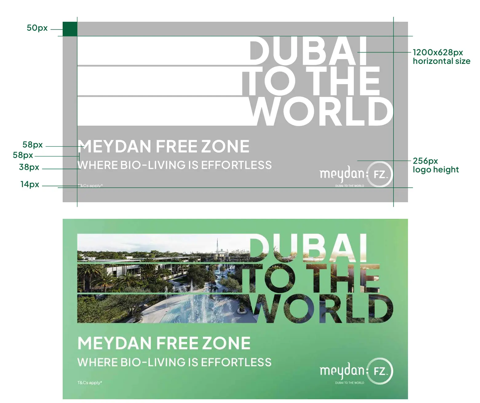
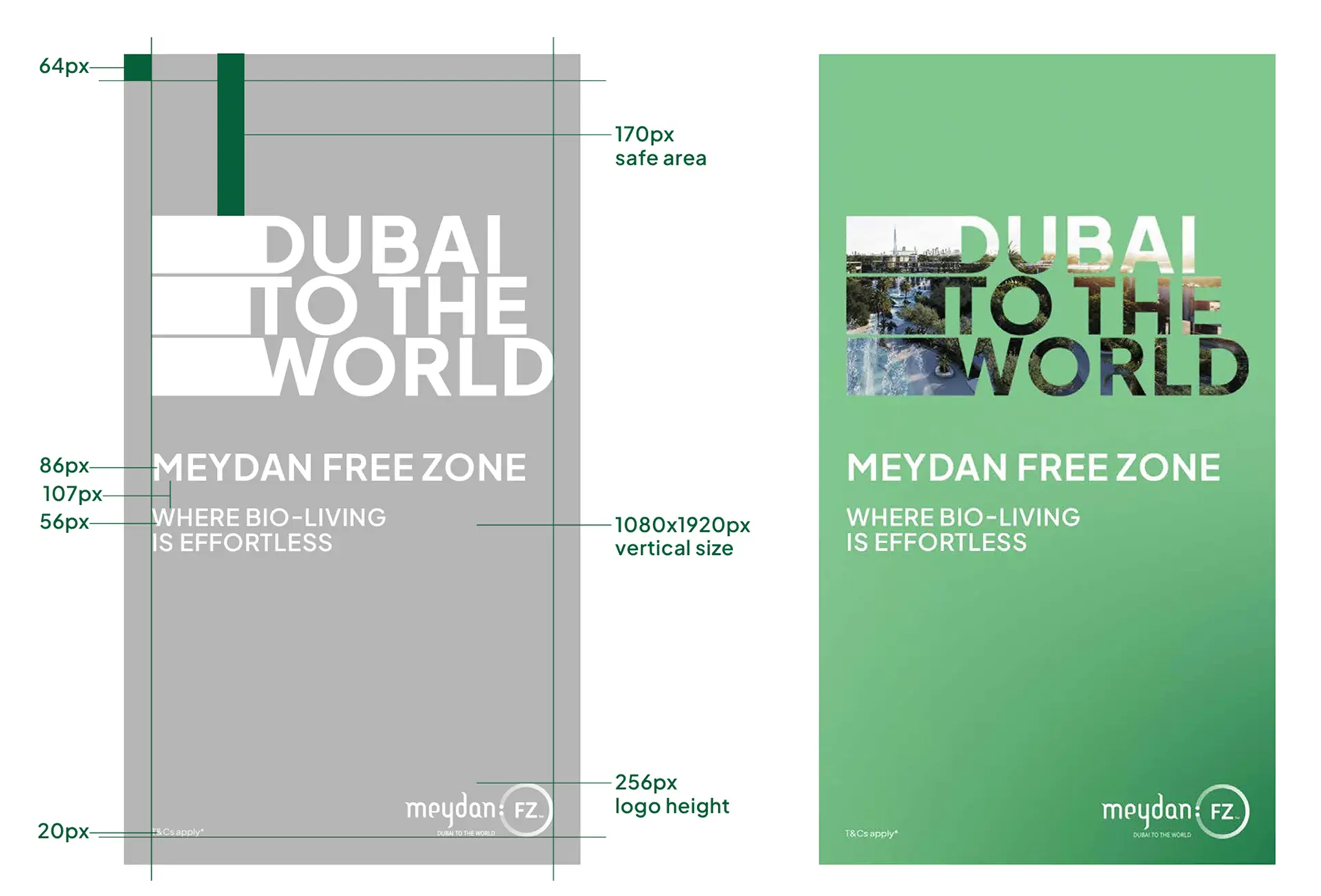
Square
Horizontal
Vertical
7. Icons
Meydan Free zone icons indicate information and interactions in a simple, direct manner. Their style derived from technical drawings. Learn how to use them, how they behave and how they are made here or find and download approved icons in the user interface guideline.
Style and structure
Icons are made up of as few elements as possible. The constructed style is created by means of a fine, constant contour thickness of one pixel and the avoidance of filled-in blocks, angles alternate with rounded corners. Icons are generally applied in black and white.
Usage
Meydan Free Zone’s icons are used across different brand touchpoints from marketing to environment to product. They provide symbolism, conceptual clarity and visual interest in simplistic shapes and forms.
Every piece of content we publish is supported by a number of smaller pieces. This section lays out our style in regards to these web elements, and explains our approach to the tricky art of SEO.
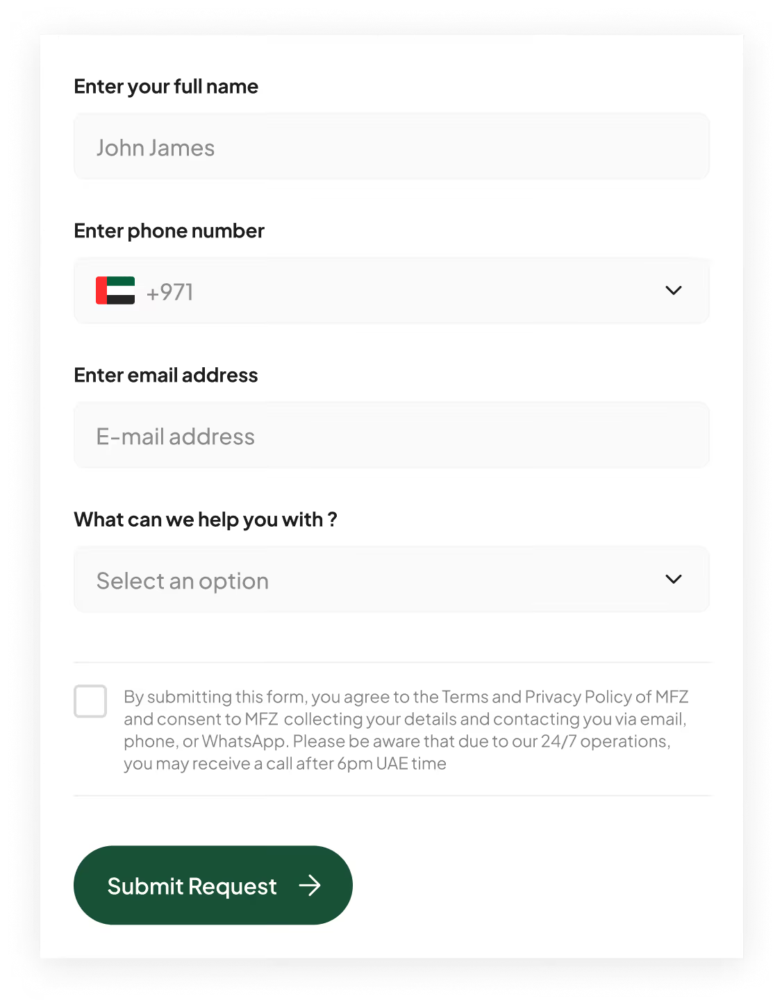
Form titles should clearly and quickly explain the purpose of the form.
Use title case for form titles and sentence case for form fields.
Keep forms as short as possible.
Only request information that we need and intend to use. Don’t ask for information that could be considered private or personal, including gender. If you need to ask for gender, provide a field the user can fill in on their own, not a dropdown menu.
Lists
Use lists to present steps, groups, or sets of information. Give context for the list with a brief introduction. Number lists when the order is important, like when you’re describing steps of a process. Don’t use numbers when the list order doesn’t matter.
If one of the list items is a complete sentence, use proper punctuation and capitalisation on all of the items. If list items are not complete sentences, don’t use punctuation, but do capitalise the first word of each item.
Navigation
Use title case for main or global navigation. Use sentence case for sub-navigation.
Navigation links should be clear and concise.
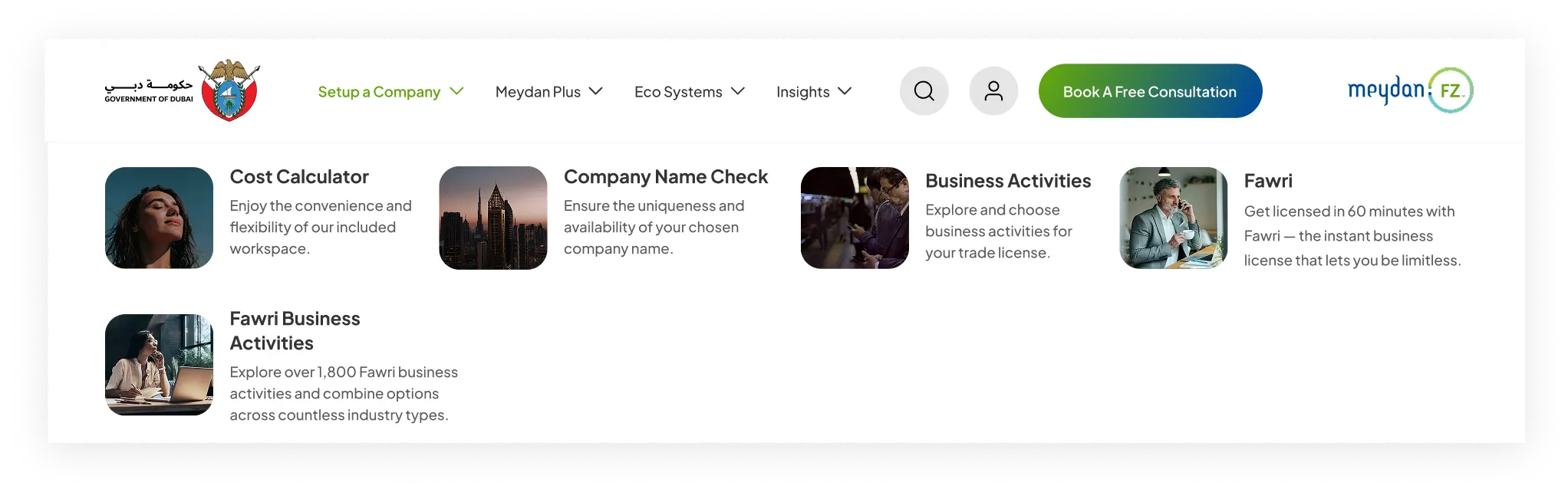
Desktop Nav
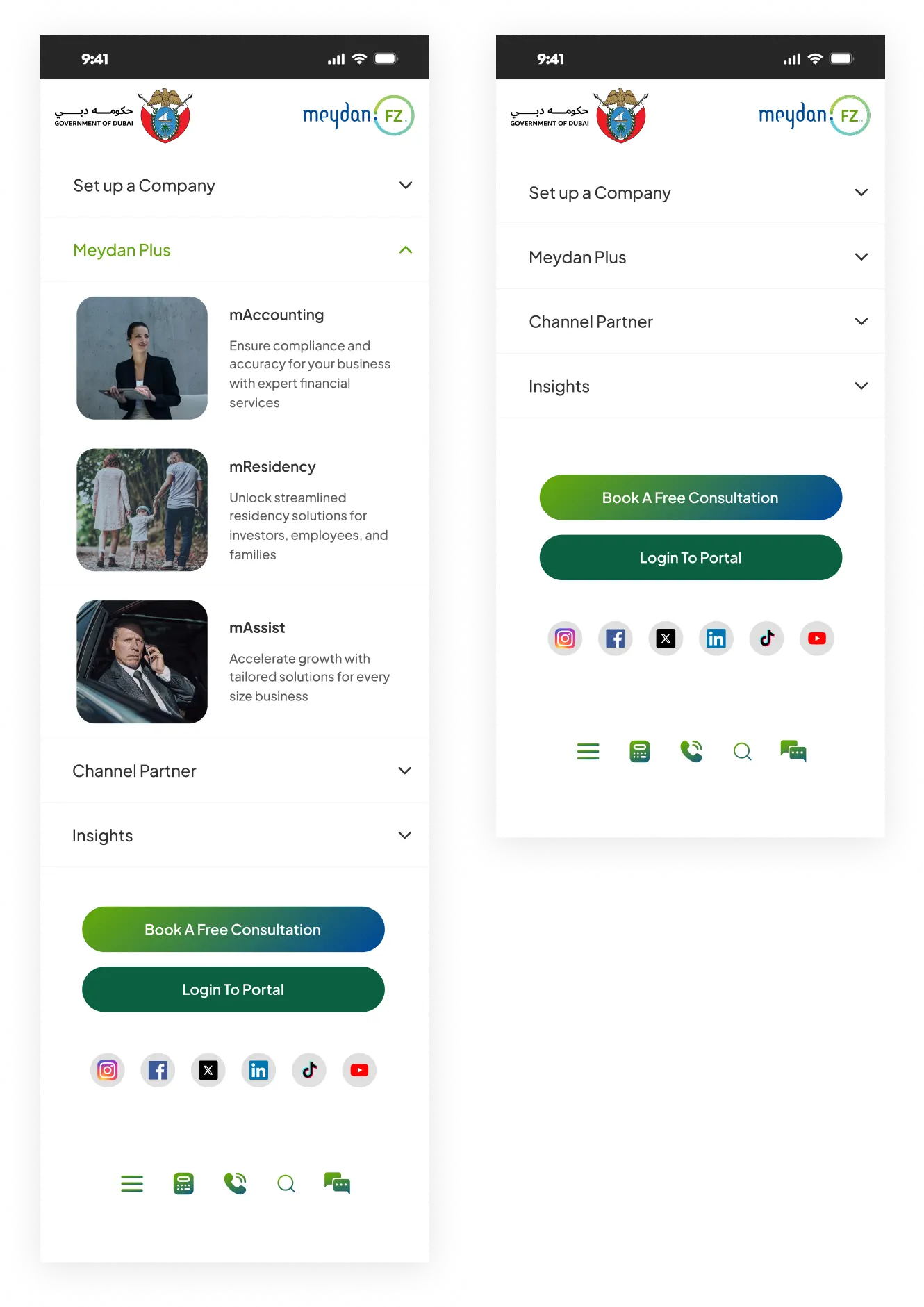
Mobile Nav
Titles
Titles organise pages and guide readers. A title appears at the beginning of a page or section and briefly describes the content that follows. Titles also tell search engines what a page is about, and show up in search results.
Titles are written (you guessed it) in title case. Don’t use end punctuation in a title unless the title is a question.